Creating a Modal Dialog Web Component in StencilJS
In the last post we created a modal dialog web component using the standard custom element and shadow DOM APIs.
As mentioned in a previous post, there are quite a few tools popping up that help us create web components. One of those tools that seems to be getting some traction recently is StencilJS. In this post we’ll create the same modal dialog as in the last post using StencilJS. We’ll hopefully discover some of the benefits of using StencilJS over the standard APIs along the way.
What is StencilJS?
The StencilJS website says it’s a “magical, reusable web component compiler”. So, basically it generates standard web components.
Getting started
So, let’s get started using the docs and start find out why StencilJS is so great …
git clone https://github.com/ionic-team/stencil-component-starter x-modalcd x-modalgit remote rm originnpm installWe can run this using:
npm start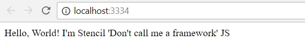
Any changes that we make to the code are automatically reflected in the running web app.
Nice!
If we browse to the sample component code at “src\components\my-component” we see “my-component.tsx”. If we look at this file we see the following code:
import { Component, Prop } from "@stencil/core";
@Component({  tag: "my-component",  styleUrl: "my-component.css",  shadow: true})export class MyComponent {  @Prop() first: string;  @Prop() last: string;
  render() {    return (      <div>        Hello, World! I'm {this.first} {this.last}      </div>    );  }}
We can see it’s using TypeScript to add typing to the props. We can also see that it is using JSX to render the component’s HTML.
Neat!
Let’s also have a look at “my-component.spec.ts”. These are unit tests for the component using Jest. We can also see stencil is providing a testing utility, TestWindow to help us write tests.
import { TestWindow } from '@stencil/core/testing';import { MyComponent } from './my-component';
describe('my-component', () => {  ...
  describe('rendering', () => {    let element: HTMLMyComponentElement;    let testWindow: TestWindow;    beforeEach(async () => {      testWindow = new TestWindow();      element = await testWindow.load({        components: [MyComponent],        html: '<my-component></my-component>'      });    });
    ...
    it('should work with a first name', async () => {      element.first = 'Peter';      await testWindow.flush();      expect(element.textContent.trim()).toEqual('Hello, World! I\'m Peter');    });
    ...  });});
This is all great - we can already start to see some benefits of stencil.
Let’s create a new folder for our modal dialog component called “x-modal” in “src/components”. Let’s then create a files called “x-modal.tsx” and “x-modal.css” in this folder.
Let’s paste in the following code to “x-modal.tsx”:
import { Component } from "@stencil/core";
@Component({  tag: "x-modal",  styleUrl: "x-modal.css",  shadow: true})export class XModal {  public render(): JSX.Element {    return <div>TODO - create a modal component!</div>;  }}
If we find and open “index.html” and reference x-modal instead of my-component. We’ll see our component displayed.
...<body> <x-modal title="Important!" visible> <p>This is some really important stuff</p> </x-modal></body>...
This is a good start.
Modal dialog specification
A reminder of what we need to build …
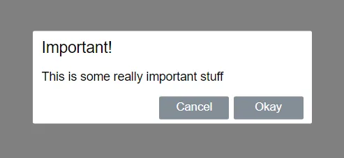
Our modal dialog should look like the image below and the markup that we have just put in “index.html” should be used to render the component.
So, our tag name is x-modal. A title attribute lets us define a title for the dialog. The content inside the x-modal tag will be the content of the dialog.
A visible attribute will determine whether the dialog is open or closed.
This dialog will have “Okay” and “Cancel” buttons which will invoke events called “ok” and “cancel” respectively.
Our basic web component
In “x-modal.css”, let’s paste in some css:
.wrapper { position: fixed; left: 0; top: 0; width: 100%; height: 100%; background-color: gray; opacity: 0; visibility: hidden; transform: scale(1.1); transition: visibility 0s linear 0.25s, opacity 0.25s 0s, transform 0.25s; z-index: 1;}.visible { opacity: 1; visibility: visible; transform: scale(1); transition: visibility 0s linear 0s, opacity 0.25s 0s, transform 0.25s;}.modal { font-family: Helvetica; font-size: 14px; padding: 10px 10px 5px 10px; background-color: #fff; position: absolute; top: 50%; left: 50%; transform: translate(-50%, -50%); border-radius: 2px; min-width: 300px;}.title { font-size: 18px;}.button-container { text-align: right;}button { margin-left: 5px; min-width: 80px; background-color: #848e97; border-color: #848e97; border-style: solid; border-radius: 2px; padding: 3px; color: white; cursor: pointer;}button:hover { background-color: #6c757d; border-color: #6c757d;}In “x-modal.tsx”, let’s update our render method:
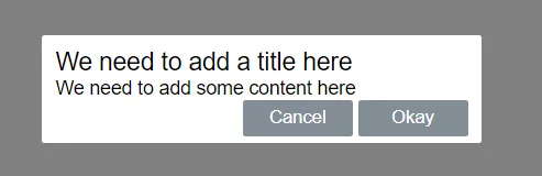
public render(): JSX.Element { return ( <div class="wrapper visible"> <div class="modal"> <span class="title">We need to add a title here</span> <div class="content">We need to add some content here</div> <div class="button-container"> <button class="cancel">Cancel</button> <button class="ok">Okay</button> </div> </div> </div> );}Our component should now look like:
Adding a title attribute
Adding a title attribute is super easy:
import { Component, Prop } from "@stencil/core";
...export class XModal {  @Prop() public title: string;  ...}
We can then reference this in the render function.
public render(): JSX.Element { return ( <div class="wrapper visible"> <div class="modal"> <span class="title">{this.title}</span> <div class="content">We need to add some content here</div> <div class="button-container"> <button class="cancel">Cancel</button> <button class="ok">Okay</button> </div> </div> </div> );}”Slotting” the content
There’s no magic when adding the slot. We simply add the slot tag as we would when using the native APIs:
public render(): JSX.Element { return ( <div class="wrapper visible"> <div class="modal"> <span class="title">{this.title}</span> <div class="content"> <slot /> </div> <div class="button-container"> <button class="cancel">Cancel</button> <button class="ok">Okay</button> </div> </div> </div> );}Adding a visible attribute
Let’s add the visible attribute now.
@Prop({ mutable: true, reflectToAttr: true})public visible: boolean;It needs to be “mutable” because we will be changing the value of this property to false when the buttons are clicked. We have also flagged “reflectToAttr” because we want to update the DOM with any changes to this attribute.
We can now reference this property in our render function:
public render(): JSX.Element { return ( <div class={this.visible ? "wrapper visible" : "wrapper"}> ... </div> );}Cool. We are making good progress. Our rendered component should now look like below. Notice also that the visible attribute automatically opens and closes the dialog.
Button handlers
On to the button handlers now. We can use the onClick property on the buttons and set this to delegate functions. So no need for addEventListener!
private handleCancelClick = () => {  this.visible = false;};
private handleOkClick = () => {  this.visible = false;};
public render(): JSX.Element {  return (    <div class={this.visible ? "wrapper visible" : "wrapper"}>      ...        <div class="button-container">          <button class="cancel" onClick={this.handleCancelClick}>            Cancel          </button>          <button class="ok" onClick={this.handleOkClick}>            Okay          </button>        </div>       ...    </div>  );}
The buttons should now close the dialog.
Expose the events
Our final task is to raise “ok” and “cancel” events when the buttons are clicked. We do this by declaring the event and variables with the @Event decorator. We can then simply call .emit at the appropriate point to raise the event.
import { Component, Event, EventEmitter, Prop } from "@stencil/core";
...export class XModal {  ...  @Event() private ok: EventEmitter;  @Event() private cancel: EventEmitter;
  private handleCancelClick = () => {    this.visible = false;    this.cancel.emit();  };
  private handleOkClick = () => {    this.visible = false;    this.ok.emit();  };  ...}
With our events in place, we can attach them as usual in “index.html”:
<script> var modal = document.querySelector("x-modal"); modal.addEventListener("ok", function () { console.log("ok"); }); modal.addEventListener("cancel", function () { console.log("cancel"); });</script>
Our modal dialog is now complete!
Wrap up
Here are some of the benefits of using StencilJS to produce standard web components (over using the custom element and shadow DOM APIs directly):
- Generally the code is more concise and easier to read
- TypeScript gives us type safety
- The
@propdecorator greatly simplifies how we deal with attributes and properties - JSX gives us reactive data binding. With the raw APIs we need to do the data binding manually
- JSX also allows “onSomething” event handlers rather than wiring up event listeners
In summary it brings a modern web development experience to producing web components!