Creating a Modal Dialog Web Component
In the last post I debated whether standard web components are finally a thing. It certainly feels like they are starting to get real traction now. So, how do you build standard web components? In this post we’ll build a simple modal dialog component …
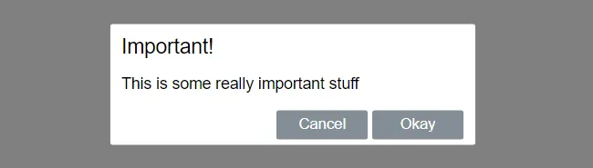
Modal dialog specification
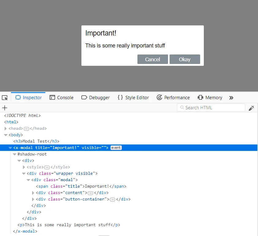
Our modal dialog will look a like above and the following markup will create it:
<x-modal title="Important!" visible> <p>This is some really important stuff</p></x-modal>So, the our tag name is x-modal. A title attribute let’s us define a title for the dialog. The content inside the x-modal tag will be the content of the dialog.
A visible attribute will determine whether the dialog is open or closed.
This dialog will have “Okay” and “Cancel” buttons which will invoke events called “ok” and “cancel” respectively.
Our basic web component
In a html page let’s create the basic web component below in a script tag.
class Modal extends HTMLElement {  constructor() {    super();  }
  connectedCallback() {    this._render();  }
  _render() {    const container = document.createElement('div');    container.innerHTML = `      <style>        .wrapper {          position: fixed;          left: 0;          top: 0;          width: 100%;          height: 100%;          background-color: gray;          opacity: 0;          visibility: hidden;          transform: scale(1.1);          transition: visibility 0s linear .25s,opacity .25s 0s,transform .25s;          z-index: 1;        }        .visible {          opacity: 1;          visibility: visible;          transform: scale(1);          transition: visibility 0s linear 0s,opacity .25s 0s,transform .25s;        }        .modal {          font-family: Helvetica;          font-size: 14px;          padding: 10px 10px 5px 10px;          background-color: #fff;          position: absolute;          top: 50%;          left: 50%;          transform: translate(-50%,-50%);          border-radius: 2px;          min-width: 300px;        }        .title {          font-size: 18px;        }        .button-container {          text-align: right;        }        button {          min-width: 80px;          background-color: #848e97;          border-color: #848e97;          border-style: solid;          border-radius: 2px;          padding: 3px;          color:white;          cursor: pointer;        }        button:hover {          background-color: #6c757d;          border-color: #6c757d;        }      </style>      <div class='wrapper visible'>        <div class='modal'>          <span class='title'>We need to add a title here</span>          <div class='content'>            We need to add some content here          </div>          <div class='button-container'>            <button class='cancel'>Cancel</button>            <button class='ok'>Okay</button>          </div>        </div>      </div>`;
    const shadowRoot = this.attachShadow({ mode: 'open' });    shadowRoot.appendChild(container);  }}window.customElements.define('x-modal', Modal);
We use window.customElements.define() to let the page know about our web component, passing in our chosen tag name and an ES6 class that gives the functionality of our component.
connectedCallback is a function that gets invoked when our component in loaded. In this function we put the html and CSS for our dialog in a big literal string in a div. We then put this div in the component’s shadow DOM.
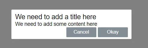
So, if we reference our component with:
<x-modal></x-modal>… we get:
Effect of the shadow DOM
Anything inside the shadow DOM of the component is protected and can’t be accessed from outside the component.
Styles are protected as well the internal elements.
This means that our component should never clash with other stuff on the page.
Neat!
Adding a title attribute
Let’s add a title attribute to our component:
class Modal extends HTMLElement {  constructor() {    super();  }
  get title() {    return this.getAttribute('title');  }
  set title(value) {    this.setAttribute('title', value);  }}
… and reference this in the markup that is rendered:
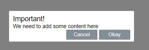
_render() { const container = document.createElement("div"); container.innerHTML = ` <style> ... </style> <div class='wrapper visible'> <div class='modal'> <span class='title'>${this.title}</span> <div class='content'> ... </div> <div class='button-container'> ... </div> </div> </div>` };If we add a title attribute the markup that references in x-modal:
<x-modal title="Important!"></x-modal>… we get:
“Slotting” the content
We can use a slot to allow custom content in our component. All we need to do is place a slot element where we want to allow custom content to be injected into our component.
_render() { const container = document.createElement("div"); container.innerHTML = ` <style> ... </style> <div class='wrapper visible'> <div class='modal'> <span class='title'>...</span> <div class='content'> <slot></slot> </div> <div class='button-container'> ... </div> </div> </div>`};If we add some content to the markup that references x-modal:
This is some really important stuff
<x-modal title="Important!"> <p>This is some really important stuff</p></x-modal>… we get:
Adding a visible attribute
Let’s add a visible attribute to show and hide the dialog.
class Modal extends HTMLElement {  get visible() {    return this.hasAttribute("visible");  }
  set visible(value) {    if (value) {      this.setAttribute("visible", "");    } else {      this.removeAttribute("visible");    }  }
  ...}
… and reference this in the markup that is rendered:
_render() { const wrapperClass = this.visible ? "wrapper visible" : "wrapper"; const container = document.createElement("div"); container.innerHTML = ` <style> ... </style> <div class='${wrapperClass}'> <div class='modal'> <span class='title'>...</span> <div class='content'> ... </div> <div class='button-container'> ... </div> </div> </div>`; }Our dialog doesn’t show by default now. To make the the dialog show, we need to add the visible attribute to x-modal:
<x-modal title="Important!" visible> <p>This is some really important stuff</p></x-modal>Reacting to attribute changes
We would like to add / remove the visible attribute after the component is rendered to hide and show the dialog. In fact we want the “okay” and “cancel” buttons to remove this attribute to hide the dialog. So, how do you do this?
We can use attributeChangedCallback() which is a function that runs whenever an attribute changes. As well as this, we need to “observe” the attributes that we want to track changes to using observedAttributes.
Let’s handle title attribute changes as well as visible attribute changes.
When the title attribute changes, we want to update our title in our shadow DOM.
When the visible attribute changes, we want to add / remove the visible CSS class to the wrapper div.
class Modal extends HTMLElement {  get visible() {...}
  set visible(value) {...}
  get title() {...}
  set title(value) {...}
  constructor() {...}
  connectedCallback() {...}
  static get observedAttributes() {    return ["visible", "title"];  }
  attributeChangedCallback(name, oldValue, newValue) {    if (name === "title" && this.shadowRoot) {      this.shadowRoot.querySelector(".title").textContent = newValue;    }    if (name === "visible" && this.shadowRoot) {      if (newValue === null) {        this.shadowRoot.querySelector(".wrapper").classList.remove("visible");      } else {        this.shadowRoot.querySelector(".wrapper").classList.add("visible");      }    }  }
  _render() {...}}
Button handlers
The buttons don’t do anything yet. We simply want them to emit the “ok” / “cancel” event and close the dialog. So, let’s first attach event handlers for our buttons that add / remove the visible attribute:
connectedCallback() {  this._render();  this._attachEventHandlers();}
_attachEventHandlers() {  const cancelButton = this.shadowRoot.querySelector(".cancel");  cancelButton.addEventListener('click', e => {    // TODO - invoke "cancel event"    this.removeAttribute("visible");  });  const okButton = this.shadowRoot.querySelector(".ok");  okButton.addEventListener('click', e => {    // TODO - invoke "ok event"    this.removeAttribute("visible");  });}
Expose the events
So, how to we raise events from our component? We can use dispatchEvent():
_attachEventHandlers() { const cancelButton = this.shadowRoot.querySelector(".cancel"); cancelButton.addEventListener('click', e => { this.dispatchEvent(new CustomEvent("cancel")) this.removeAttribute("visible"); }); const okButton = this.shadowRoot.querySelector(".ok"); okButton.addEventListener('click', e => { this.dispatchEvent(new CustomEvent("ok")) this.removeAttribute("visible"); });}If we subscribe to these events in the consuming code we should find that they are handled when the buttons are clicked:
<button class="open">Open</button><x-modal title="Important!" visible>  <p>This is some really important stuff</p></x-modal>
<script>  modal = document.querySelector('x-modal');  modal.addEventListener('cancel', function () {    console.log('cancel event raised');  });  modal.addEventListener('ok', function () {    console.log('ok event raised');  });
  open = document.querySelector('.open');  open.addEventListener('click', function () {    modal.visible = true;  });</script>
Wrap up
So, that’s it - a simple modal dialog using standards based web components using a custom element with a shadow DOM.
The full code is in github. Hope that you find this useful!
Comments
Raymund August 25, 2019
Great post! I’m so grateful to look into your article, not only saved me but the opportunity of understanding such functions or whatever we call it. (e.g. connectedCallback(), attributeChangedCallback(…,…,…) etc. I’m seeing them everyday for the past 3 weeks but don’t exactly comprehend to how use it. I’m an average developer and I had a hard time looking for a modal component to work right away by putting stuff together. But this one is a bomb! honestly man, Thank you.