Providing a Styling API for Web Components via CSS Custom Properties
The last few posts have been about web components. One thing we’ve not touched on is how you can allow consumers of our web components to change the styling. For a web component to be reusable across many different projects with different styling requirements, this is important. But how do we do this? Doesn’t the shadow DOM make that a bit tricky? …

The problem
Let’s take our modal dialog we have been working on in last couple of posts.
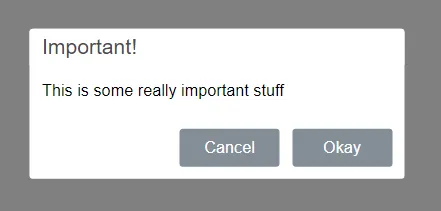
We’d like to give consumers of the component the ability to change the heading colour, button colours, the font, …
If we put an inline style to set the text colour on a reference to
<x-modal title="Important!" visible style="color:red;"> <p>This is some really important stuff</p></x-modal>… we get:
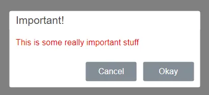
So, the slotted content picks up the style but the rest of the elements don’t. This makes sense because the shadow DOM is protecting the internal elements.
So, how can we give consumers of x-modal the ability to style the internal elements such as the heading and the buttons?
CSS custom properties to the rescue!
CSS custom properties are a handy feature that pierce the shadow DOM.
First we need to declare the CSS properties we want the consumers to be able to change using the var() CSS function:
var(--variable-name, fallback-value);So, instead of referencing fixed values in our component CSS, we can reference CSS variables. Let’s use some of this good stuff in x-modal.css:
... .x-modal { font-family: var(--font-family, Helvetica); font-size: var(--font-size, 13px); ...;}.x-modal-header { ... border-top-left-radius: var(--border-radius, 0.2em); border-top-right-radius: var(--border-radius, 0.2em); background-color: var(--header-bg-color, #fff); color: var(--header-color, #4c4b4b);}... .x-modal-buttons button { ... border-radius: var(--border-radius, 0.2em); color: var(--button-color, white);}.x-modal-cancel { background-color: var(--cancel-bg-color, #848e97); border-color: var(--cancel-bg-color, #848e97);}.x-modal-cancel:hover { background-color: var(--cancel-hover-bg-color, #6c757d); border-color: var(--cancel-hover-bg-color, #6c757d);}.x-modal-ok { background-color: var(--ok-bg-color, #848e97); border-color: var(--ok-bg-color, #848e97);}.x-modal-ok:hover { background-color: var(--ok-hover-bg-color, #6c757d); border-color: var(--ok-hover-bg-color, #6c757d);}With the changed CSS in place, a component consumer can reference x-modal without doing anything special and get the original dialog. This is because the var fallback values will kick in.
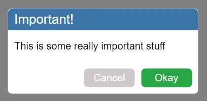
However, component consumers can now set the values of the CSS properties we declared:
<head>  ...  <style>    x-modal {      --font-family: Arial;      --font-size: 16px;      --border-radius: 0.4em;      --header-bg-color: #3b75a9;      --header-color: #fff;      --ok-bg-color: #28a745;      --ok-hover-bg-color: #227134;      --cancel-bg-color: #d0c7c9;      --cancel-hover-bg-color: #afa9aa;      --button-color: #fff;    }  </style></head>
<body>  ...  <x-modal title="Important!" visible>    <p>This is some really important stuff</p>  </x-modal>  ...</body>
… which then styles the relevant CSS properties on the internal elements:
Dynamically setting CSS properties in JavaScript
A component consumer can also dynamically set the CSS properties in JavaScript using style.setProperty()
element.style.setProperty("--varName", value);So, if we wanted to set the modal dialog header to red dynamically we can do:
document.querySelector("x-modal").style.setProperty("--header-bg-color", "red");Browser support
Browser support is good:
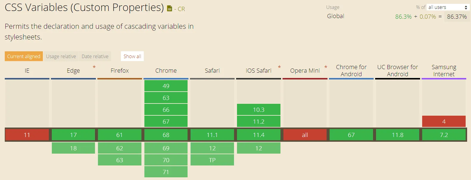
Even though “Can I Use” says there is no support for IE, they worked for me on IE with a component generated by stenciljs.
A better solution?
CSS properties are fine where we only want a few bits in our component to be styleable. However, the more bits we want to make styleable, the more work we have to do as component authors declaring all those CSS properties.
In some situations it would be great if we could just say the whole of an internal element is styleable. CSS shadow parts promises to let us do just that! However, the spec has only just been drafted, so, it’s probably going to be a while before we are going to be able to use this.
Wrap up
CSS properties allow us to provide a nice styling API for our web components. Browser support is good and it’s super easy to implement.
The full source code for x-modal is on my github.