Playing with Styled Components
Styled components is a popular CSS-in-JS library in the React community that allows styles to be easily scoped to components without having to worry about CSS class naming conventions. In fact you don’t create class names at all with styled components! Let’s dig in and find out more including whether they play nicely with TypeScript …

VS Code extension
There is a great VS code extension that we can install called vscode-styled-components that will give us syntax highlighting and intellisense within our styled components.
Installing styled components
We can install styled components with the corresponding TypeScript types using the following npm commands:
npm install styled-componentsnpm install @types/styled-components --save-devStarting point - an unstyled list
We have the following unstyled list as a starting point:
...
<div>  <ul>    {posts.map(({ id, title, body }) => (      <li key={id}>        <div>          <span>{title}</span>          <span>{body}</span>        </div>      </li>    ))}  </ul></div>
...
… which looks like the following when rendered in a browser:
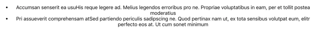
It doesn’t look great, so let’s apply some styles to it using styled components.
Basic styled component
We create a styled component using the styled factory function from the styled component library, specifying the HTML tag that we want rendered as well as the CSS in a tagged template literal:
import styled from 'styled-components';
const Container = styled.div`  width: 400px;  margin: 30px auto;`;
const App = () => (  <Container>    <ul>      {posts.map(({ id, title, body }) => (        <li key={id}>          <div>            <span>{title}</span>            <span>{body}</span>          </div>        </li>      ))}    </ul>  </Container>;);
So, we created a Container styled component that can be consumed as a regular React component.
Referencing variables in CSS
We have some global style variables that we want to reference in our CSS:
// Graysexport const gray1 = "#383737";export const gray2 = "#565555";export const gray3 = "#857c81";export const gray4 = "#b9b9b9";export const gray5 = "#e0dddd";
// Colorsexport const primary1 = "#6ca583";export const accent1 = "#9b8dab";
// Fontsexport const fontFamily = "'Segoe UI', 'Helvetica Neue',sansserif";export const fontSize = "15px";
Our styled component is a tagged template literal, so, we can use interpolation in order to reference the variables:
...import { fontFamily, fontSize, gray2 } from './Styles';
const Container = styled.div`  width: 400px;  margin: 30px auto;  font-family: ${fontFamily};  font-size: ${fontSize};  color: ${gray2};`;
...
Nested structures
We can nest CSS definitions to style nested elements like in SCSS:
const Container = styled.div` width: 400px; margin: 30px auto; font-family: ${fontFamily}; font-size: ${fontSize}; color: ${gray2}; ul { list-style: none; padding: 0px 20px; background-color: #fff; border-bottom-left-radius: 4px; border-bottom-right-radius: 4px; border-top: 3px solid ${accent1}; box-shadow: 0 3px 5px 0 rgba(0, 0, 0, 0.16); li { padding: 10px 0px; border-top: 1px solid ${gray5}; :first-of-type { border-top: none; } } }`;Notice also how we can reference pseudo elements. We use a pseudo element above to remove the top border on the first list item.
Creating separate styled components
It is arguably better to separate the above out into separate components creating more opportunity for reuse:
const Container = styled.div`  width: 400px;  margin: 30px auto;  font-family: ${fontFamily};  font-size: ${fontSize};  color: ${gray2};`;
const List = styled.ul`  list-style: none;  padding: 0px 20px;  background-color: #fff;  border-bottom-left-radius: 4px;  border-bottom-right-radius: 4px;  border-top: 3px solid ${accent1};  box-shadow: 0 3px 5px 0 rgba(0, 0, 0, 0.16);`;
const ListItem = styled.li`  display: flex;  flex-direction: column;  padding: 10px 0px;  border-top: 1px solid ${gray5};  :first-of-type {    border-top: none;  }`;
const Title = styled.span`  font-size: 18px;  color: ${gray1};  margin-bottom: 5px;`;
const App = () => (  <Container>    <List>      {posts.map(({ id, title, body }) => (        <ListItem key={id}>          <Title>{title}</Title>          <span>{body}</span>        </ListItem>      ))}    </List>  </Container>;);
So, we’ve created styled components for the list and its items along with the title in each item.
Responsive styled components
What about media queries? We can use them just as you would expect:
const Container = styled.div` width: 400px; margin: 30px auto; font-family: ${fontFamily}; font-size: ${fontSize}; color: ${gray2}; @media (max-width: 400px) { width: 100%; }`;So, we’ve made the list take up the whole width on small devices.
Inheritance
We can base a styled component on another styled component:
const Text = styled.div`  font-family: ${fontFamily};  font-size: ${fontSize};  color: ${gray2};`;
const Title = styled(Text)`  font-size: 18px;  color: ${gray1};  margin-bottom: 5px;`;
So, we have a Title component that inherits from a general Text component.
Rendering a different tag
When referencing a general component, for a certain case, we may want to render the component as a different tag. We can do this using the as prop:
<Text size={20} as="p"> {body}</Text>Our general Text component usually renders as a span but we’ve used the as prop to render it as a p.
Props
Can we pass props to styled components? Of course we can!
We can use a TypeScript interface to define the props and then reference them in the CSS using an arrow function in the template literal. We then reference the prop as usual in the JSX:
...
interface ITextProps {  size?: string;}const Text = styled.div<ITextProps>`  font-family: ${fontFamily};  font-size: ${props => props.size || fontSize};  color: ${gray2};`;
...
const App = () => (  <Container>    <List>      {posts.map(({ id, title, body }) => (        <ListItem key={id}>          <Title>{title}</Title>          <Text size="14px" as="p">            {body}          </Text>        </ListItem>      ))}    </List>  </Container>);
So, we have created an optional size prop on the Text component that falls back to the fontSize global variable.
What does it look like in the browser?
Our list looks nice but what are those funny CSS class names?
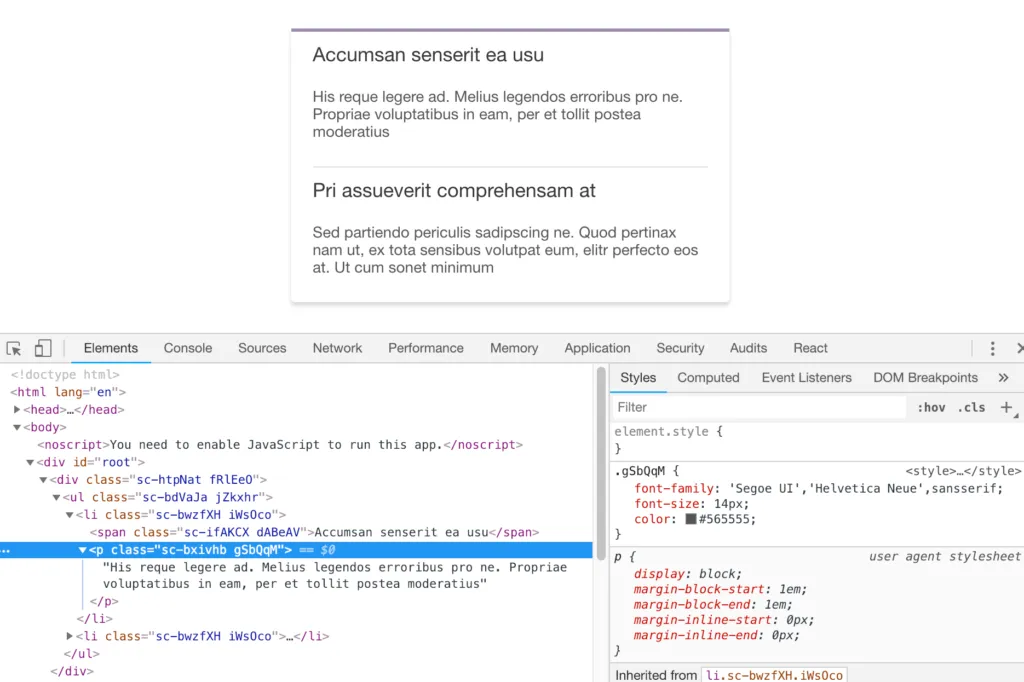
These CSS classes reference the styles we defined in our styled components. So, the styles aren’t inline styles on the elements as me might have thought. Instead the styles are held in unique CSS classes.
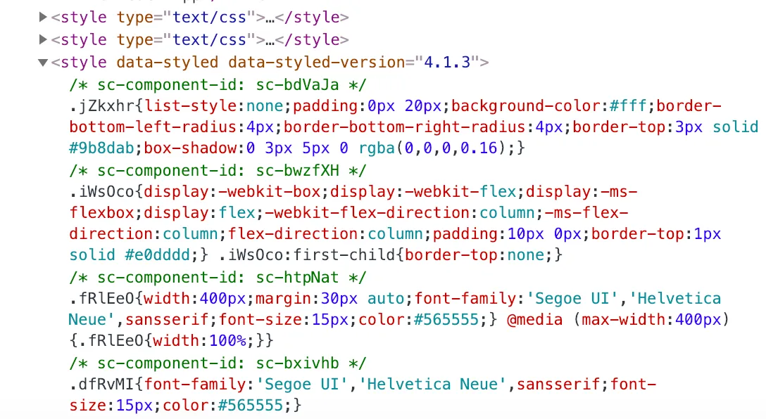
Where are those CSS classes in the rendered page? Well, they are injected into the HTML head in a style tag:
Wrap up
Styled components are a neat approach to scoping styles to React components. It’s great how we write the styles in regular CSS with the ability to use nested structures and variables like we can in SCSS. We can leverage TypeScript to get strong-typing in the props we pass to styled components. The random looking CSS class names are strange at first, but you get used to it after a while.
Learn React with TypeScript - 3rd Edition
NewA comprehensive guide to building modern React applications with TypeScript. Learn best practices, advanced patterns, and real-world development techniques.
View on Amazon