Implementing Dark Mode in a React App with CSS Properties
Dark mode is a feature that allows users to choose a dark color scheme and is supported in macOS, iOS, Android, and Windows 10. In this post, we will cover how dark mode support can be added to a React app with the help of CSS properties.

Getting the preferred color scheme from the OS
The users preferred colour scheme from the OS is held within the prefers-color-scheme CSS media feature. We can get the value of this
using a matchMedia method on the Window object in JavaScript:
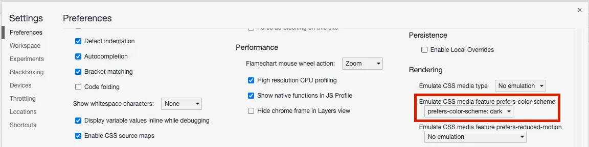
const darkOS = window.matchMedia( "(prefers-color-scheme: dark)").matches;To test this in Chrome, we can set prefers-color-scheme in DevTools. We find this in the Settings > Preferences section.
Holding the theme in React context
We will use React context to hold the current theme (light or dark) and allow any component to consume this. The theme context will also enable the theme to be set to a different value than the OS color scheme.
Let’s start by creating the context:
type ThemeName = "light" | "dark";type ThemeContextType = { theme: ThemeName; setTheme: (name: ThemeName) => void;};const ThemeContext = React.createContext< ThemeContextType>(undefined!);We are using a TypeScript union type to enforce that the theme name can be only "light" or "dark".
We can then create a provider component for this context that components can consume:
type Props = {  children: React.ReactNode,};export const ThemeProvider = ({  children,}: Props) => {  const [themeName, setThemeName] =    React.useState<ThemeName>("light");
  React.useEffect(() => {    const darkOS = window.matchMedia(      "(prefers-color-scheme: dark)"    ).matches;    setTheme(darkOS ? "dark" : "light");  }, []);
  const setTheme = (name: ThemeName) => {    setThemeName(name);  };  return (    <ThemeContext.Provider      value={{ theme: themeName, setTheme }}    >      {children}    </ThemeContext.Provider>  );};
We store the theme name in state. We use a useEffect hook after the initial render, to set the initial theme to the color scheme from the OS.
We can also create a custom hook to get and set the theme name:
export const useTheme = () => React.useContext(ThemeContext);ThemeProvider can then be wrapped around components that need to access the theme:
export default function App() { return ( <ThemeProvider> <Page /> </ThemeProvider> );}The useTheme hook can be used within a component to access and set the theme name:
const Page = () => { const { theme, setTheme } = useTheme(); return ( <div> <h1>{theme}</h1> <button onClick={() => setTheme( theme === "dark" ? "light" : "dark" ) } > {theme === "dark" ? "Switch to light mode" : "switch to dark mode"} </button> </div> );};Using CSS properties for colors
CSS Properties allow CSS to be based on dynamic variables that can be changed at runtime. They are sometimes called CSS variables.
We define the CSS properties in the :root pseudo-class. This is the root element of a tree representing the document.
:root { --background-color: #fefefe; --color: #343434;}We have initialized these values to light mode colors.
We can then reference these CSS properties in other CSS class definitions using the var function:
body { background-color: var(--background-color); color: var(--color);}Setting a CSS property in a React component
We can hold the colours for the themes in an object literal:
const themeColours = { light: { color: "#343434", backgroundColor: "#fefefe", }, dark: { color: "#fff", backgroundColor: "#3f3f3f", },};In the theme context provider we can set the CSS property values using the setProperty method on the style as follows:
const setTheme = (name: ThemeName) => { document.body.style.setProperty( "--color", themeColours[name].color ); document.body.style.setProperty( "--background-color", themeColours[name].backgroundColor ); setThemeName(name);};That completes all the key parts of implementing dark mode in a React app.
A working example of the code in this post is available in CodeSandbox at https://codesandbox.io/s/dark-mode-on6gi.
Learn React with TypeScript - 3rd Edition
NewA comprehensive guide to building modern React applications with TypeScript. Learn best practices, advanced patterns, and real-world development techniques.
View on Amazon