

Accessible React Forms
The last post covered a couple of tools that help developers create accessible apps. Forms are a common part of many apps, and they must be accessible so that many different people can use them efficiently. This post covers several points on creating accessible React forms.
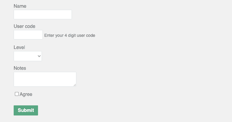
An inaccessible form
Here’s a form that has several accessibility problems:
export function InaccessibleForm() {
  ...
  return (
    <form className="inaccessible-form" ...>
      <div className="inaccessible-field">
        <label>Name</label>
        <input type="text" ... />
        {errors.name && <div className="error">You must enter your name</div>}
      </div>
      <div className="inaccessible-field">
        <label>User code</label>
        <div className="user-code-field">
          <input type="text" ... />
          <span className="user-code-help">Enter your 4 digit user code</span>
        </div>
        {errors.userCode && (
          <div className="error">You must enter your 4 character user code</div>
        )}
      </div>
      <div className="inaccessible-field">
        <div id="level-label">Level</div>
        <select ...>
          ...
        </select>
        {errors.level && <div className="error">You must enter your level</div>}
      </div>
      <div className="inaccessible-field">
        <label>Notes</label>
        <textarea ... />
        {errors.notes && <div className="error">You must enter some notes</div>}
      </div>
      <div className="inaccessible-field">
        <input type="checkbox" />
        <label>Agree</label>
      </div>
      <button type="submit">Submit</button>
    </form>
  );
}
When a field editor gains focus, a screen reader won’t read out a field label in the above form. This makes it hard for blind users to understand what to enter in each field.
Also, screen readers won’t read out validation error messages that appear. So, blind users won’t know that they have entered something wrong in a field.
The labels and validation error messages aren’t visually very clear as well. This makes it hard for users with poor sight to understand the form.
Here’s a screenshot of the form:
Associating a field label with an editor
For a screen reader to read a field label when the editor gains focus, the label must be associated with the editor. There are several ways to do this.
The typical way to do this is to reference the editor id from the label htmlFor prop (for attribute when in the DOM):
<label htmlFor="name">Name</label>
<input id="name" type="text" ... />
The association can be made the other way around, with the editor’s aria-labelledby prop. This is useful when the label isn’t a label element:
<div id="level-label">Level</div>
<select aria-labelledby="level-label">
  ...
</select>
The association can also be made by wrapping the label element around the editor:
<label>
  <input type="checkbox" />
  Agree
</label>
Another benefit of associating field labels with editors is that the user can click on the label to set focus to the form control. In addition, clicking the label on a checkbox or radio button field toggles the checked state. This is helpful on small screens, particularly when targeting small checkboxes and radio buttons.
Nice! ☺️
Associating an editor with information text
Sometimes there is additional information text for a field in addition to the label. If that element is associated with the editor, a screen reader will read it when the editor gains focus.
The aria-describedby prop on the editor can be used to associate it with the element that contains more information about it:
<label htmlFor="userCode">User code</label>
<div ...>
  <input
    id="userCode"
    type="text"
    aria-describedby="user-code-help"    ...
  />
  <span id="user-code-help" ...>    Enter your 4 digit user code
  </span>
</div>
In the above example, when the input element gains focus, a screen reader will read
out “Enter your 4 digit user code” in addition to the label “User code”.
Note that this approach is preferred to using the placeholder prop because:
- Screen reader support for
aria-describedbyis much better thanplaceholder. - Placeholder instructions may not visually fit the box, as in our example.
- Placeholder instructions disappear as soon as the user starts typing.
Adding autocomplete to fields
Adding autocomplete to fields with common data with other forms allows users to populate those fields instantly using values from their previous submissions. This is a nice time saver for general users and particularly helpful for people with motor disabilities.
Autocomplete can be controlled using the autoComplete prop (renders to an autocomplete attribute) and is available on input, select and textarea elements:
<input
  id="name"
  type="text"
  autoComplete="name"  ...
/>
Setting autoComplete to "name" value means the browser will suggest full names that have previously been filled in on forms.
Marking an editor as required
All the fields in the example form are required, but visually there is no indication that this is the case. In addition, a screen reader won’t be aware that fields are required.
We will use a * after the label as the visual required indicator:
<label htmlFor="name">
  Name
  <i aria-hidden="true">*</i></label>
We have used aria-hidden on the star element so that the screen reader doesn’t announce the word “star”. Instead, we want the screen reader to announce “required” - we do that with aria-required="true" on the editor element:
<input
  ...
  aria-required="true" />
Note that we aren’t using the required prop because this would cause the browser to validate the field, and we want to control validation (with the help of React Hook Form in this example).
Marking an editor as invalid
Using the aria-invalid prop, a field editor can be marked as valid or invalid. Setting this to "true" means the field is invalid, and setting it to "false" means it is valid:
<input
  id="name"
  type="text"
  aria-invalid={errors.name ? "true" : "false"}  {...register("name", { required: true })}
/>
This example form uses React Hook Form, so a field is invalid if it is in the errors state.
A screen reader will say that the field is invalid when it gains focus when aria-invalid="true" is set.
Accessible inline validation error messages
There are a couple of things to do to get a screen reader to read a validation error:
- For the screen reader to announce the error when first rendered in the DOM, the element that contains the error message needs to contain
role=alert. - For the screen reader to announce the error when the invalid field editor has focus, the editor needs to be associated with the error message element. The association is achieved by referencing the error message id in the field editors
aria-describedbyprop.
Here’s an example field in our form:
<input
  ...
  aria-describedby="name-error" />
{errors.name && (
  <div
    id="name-error"     role="alert"     ... >
    You must enter your name
  </div>
)}
aria-describedby can reference multiple error message elements by listing all the error message element ids separated by a space.
An interesting case is when aria-describedby is used for additional information, like the User Code field in our form. We could reference both the additional information and error message elements separated by a space. However, the screen reader will read out both messages, which may not be desirable. In our example, we only reference the error message when there is an error; otherwise, we reference the instructions:
<div className="user-code-field">
  <input
    id="userCode"
    ...
    aria-describedby={errors.userCode ? "user-code-error" : "user-code-help"}  />
  <span id="user-code-help" className="user-code-help">    Enter your 4 digit user code
  </span>
</div>
{errors.userCode && (
  <div id="user-code-error" role="alert" className="error">    You must enter your 4 character user code
  </div>
)}
Accessible text colour contrast
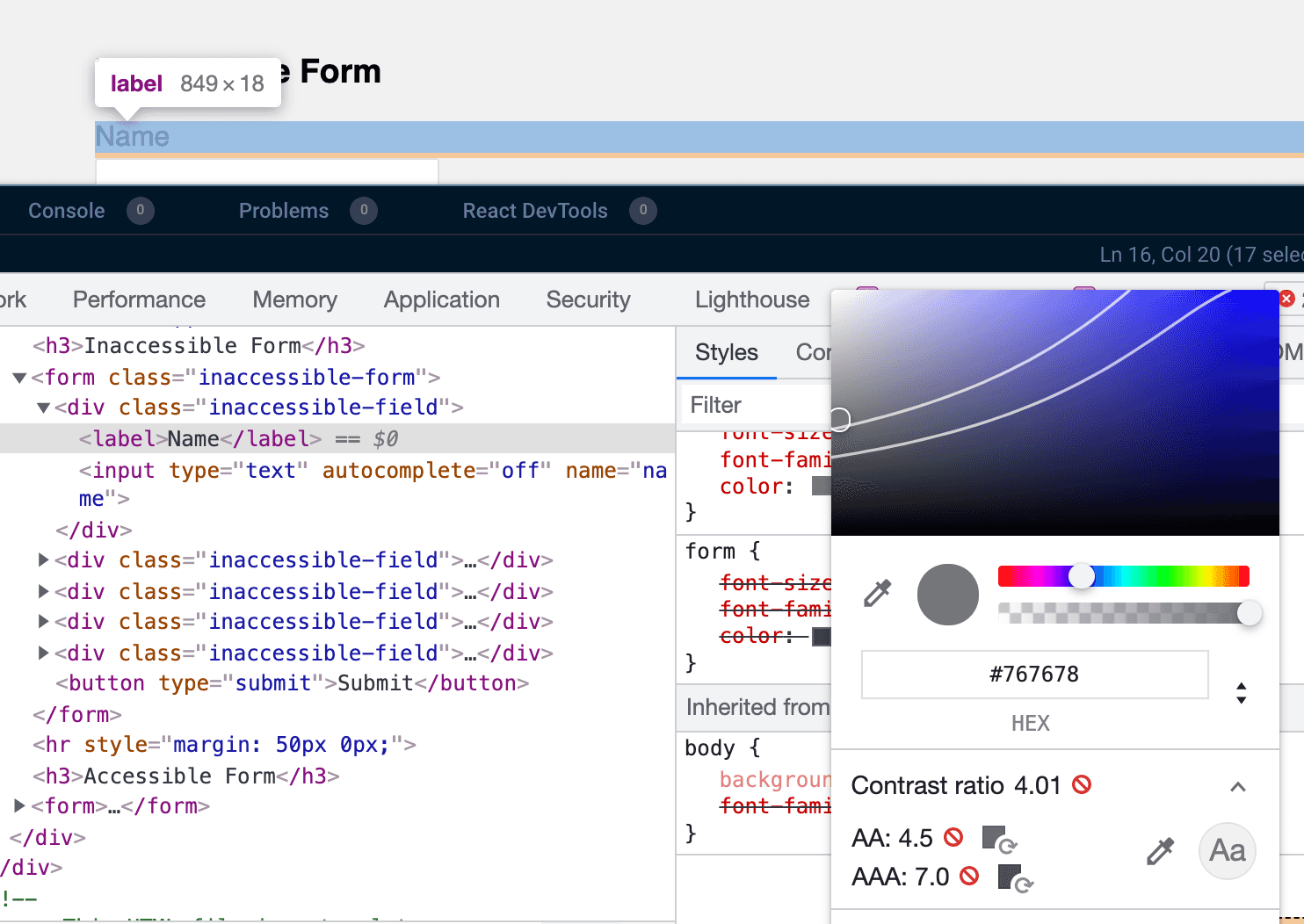
Another part of accessibility is the visual side. For example, text needs to be clearly visible. This means the text colour needs to have a certain level of contrast with its background.
This page on the web accessibility in mind site details how text colour contrast can be checked in Chrome DevTools. This tool confirms the field labels fail that check:
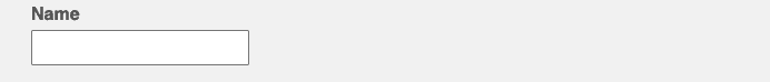
Making the form text a little darker and labels bold makes the form a lot clearer visually:
form.accessible-form {
  ...
  color: #555555;
}
form .field label {
  ...
  font-weight: 600;
}
Accessible focus indicators
A focus indicator is a visual indicator of which element currently has focus. This is crucial for keyboard users.
Many apps remove focus indicators, like in our inaccessible form example:
form .inaccessible-field input:focus {
  outline: none;
}
Keyboard users will find it challenging to fill in our accessible form because it isn’t easy to know which field has focus. So, we should avoid removing the focus indicator as in the above example.
Browsers have a default style for the outline of elements for keyboard users. However, focus indicators must be clearly visible. This means a high enough colour contrast with adjacent elements - unfortunately, the browser default focus indicator may not meet this requirement. 😞
Sara Soueidan has a great post on the accessibility requirements for focus indicators.
The focus-visible pseudo-class allows us to set an accessible outline when the element is focused:
form .field input:focus-visible {
  outline: 2px solid #737373;
  outline-offset: 2px;
}
form.accessible-form button[type="submit"]:focus-visible {
  outline: 2px solid #11683f;
  outline-offset: 2px;
}
The focus-visible pseudo-class is preferable to focus because it is only applied for keyboard users. For example, if a user clicks the Submit button with a mouse, the outline won’t be applied for a focus-visible pseudo-class, but it will be for focus.
That’s it. The form is far more accessible now! 😊
The code from this post is available in Codesandbox in the link below.
Did you find this post useful?
Let me know by sharing it on Twitter.If you to learn about using TypeScript with React, you may find my course useful:

